Our colour palette reflects who we are: bold, trustworthy, and forward-thinking.
Navy is our primary brand colour. It’s used across key brand assets to convey stability and professionalism.
Orange is our accent colour, used sparingly to bring energy and draw attention to key elements like buttons, icons, and highlights.
Ice Blue provides a clean, calm base. It’s often used in backgrounds, spacing, and layouts to support clarity and readability.
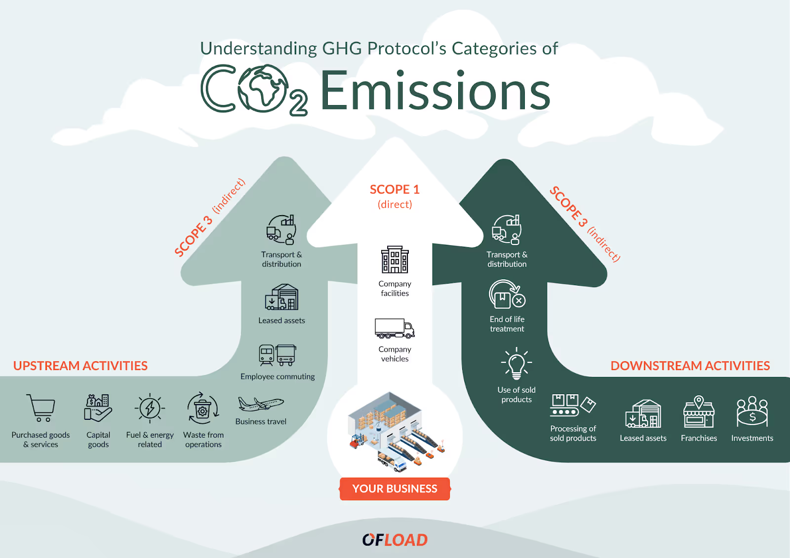
Forest supports sustainability messaging and signals our environmental initiatives.
These colours work together to create a strong, cohesive identity across all touchpoints.

.avif)
Colour Application
To maintain a cohesive and purposeful visual identity, each brand colour is used according to its defined role and context.
Navy is primarily used for backgrounds and heading text.
Orange is our accent colour, applied for highlights and emphasis.
Ice Blue serves as a light base, often used for backgrounds.
Forest is used as a background or secondary accent, particularly in sustainability-related content.